- Home /
- Academy /
- Technical SEO /
- The rel="alternate" mobile attribute - Beginners Guide
The rel= "alternate" mobile attribute - Beginners Guide

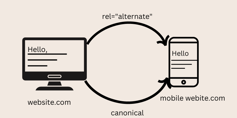
In general, when you have separate mobile and desktop websites, you must make the relationship between them clear to search engines for them to understand which website to serve to their users and to avoid duplicate content issues.
When implementing this attribute, keep the following best practices in mind:
- Bidirectional references from desktop to mobile using the mobile attribute and the canonical link from mobile to desktop.
- One-to-one correspondence: each desktop page has one mobile counterpart and vice versa.
- Avoid using redirects and instead refer to actual pages.
- Use absolute URLs that include both the domain name and the protocol.
In this blog, we will learn the rel="alternate" mobile attribute detailed elaborate guide.
What is rel="alternate"?
When people discuss rel="alternate" mobile, rel="alternate" media tag, or rel="alternate" media attribute, they are referring to the following link relationship:
href="http://m.example.com/" link rel="alternate" media="only screen and (max-width: 640px)" href="http://m.example.com/">
For the sake of simplicity, we'll refer to it as the mobile attribute from now on. This link relation is used to indicate to search engines the relationship between a desktop and a mobile website. If you have a desktop and mobile website and are concerned about mobile SEO, you must use the mobile attribute. Only Google and Yandex currently support the use of the mobile attribute.
The rel="alternate" tag combined with max-width:640px tells Google that the page is optimized for mobile devices and has a maximum width of 640px so that Google may prefer other sites based on the user's screen resolution. If at all possible, avoid using m.example.com and instead employ a responsive design. Here is some information about responsive design and the devices to expect. Mobile phones are rapidly approaching the resolution of tablets and ultrabook laptops.
When to use the mobile attribute?
If a significant portion of your visitors is coming from mobile devices, it may be worthwhile to optimize their experience with a dedicated mobile website. This is distinct from having a "responsive website." A responsive website is a single website with a layout that adjusts to the device it's displayed on, whereas a dedicated mobile website is a fully separate website with its URL.
When you have separate desktop and mobile websites, you want search engines to show the appropriate version of the website to the relevant user. When desktop users use search engines and your website appears, you want them to land on your desktop website.
You want search engines to show your mobile website if they're on a mobile device.
How to implement the mobile attribute?
HTML implementation
On the desktop version Use the link relation definition in the HTML of the desktop page to point to the mobile version of the page:
href="http://m.example.com/" link rel="alternate" media="only screen and (max-width: 640px)" href="http://m.example.com/">
This means that when the width of the user's device is less than 640 pixels, the mobile website should be served.
Mobile attribute best practices
Bidirectional references
For search engines to understand the relationship between desktop and mobile pages, the desktop page must have the mobile attribute, and the mobile page must "confirm" the relationship with the canonical URL.
One-on-one relationships
Each desktop page should have only one mobile equivalent and vice versa.
Avoid using redirects
Avoid using rel=alternate mobile and rel=canonical tags, which point to URLs that redirect to different pages. This causes problems for search engines.
Make use of absolute URLs
Even though it is not against the link tag specification, the consensus is to avoid using relative URLs when defining the mobile attribute. Search engines are more likely to misinterpret relative URLs. The canonical URL, hreflang attribute, and pagination attributes all follow the same best practice.
Why are search engines disregarding my mobile attribute?
The mobile attribute is more of a signal than a directive. Search engines are not required to follow your mobile attribute definition, but they usually do.
Examples of the attribute and applications
Here are some examples of User Attributes and how they might be used in your app:
Age:
A Summer Break campaign should be aimed at users under the age of 18.
App's function:
Avoid giving freemium users instructions on how to use advanced features.
Days of service registered:
Prompt service onboarding campaigns only during the first 15 days of service use.
Did the user enable touch ID authentication?
Only provide instructions on how to enable touch ID for end users who haven't done so yet.
Customer types:
All end-users in your app who have been identified as strong prospects for a specific offering should be targeted.
Conclusion:
Finally, the rel attribute specifies the connection between a linked resource and the current document. Valid on <link>, <a>, <area>, and <form>, the supported values vary depending on which element the attribute is found on.
The value of the rel attribute, if present, specifies the type of relationship as an unordered set of unique space-separated keywords. Unlike a class name, which does not express semantics, the rel attribute must express semantically valid tokens for both machines and humans. The IANA link relation registry, the HTML Living Standard, and the freely editable existing-rel-values page in the microformats wiki, as suggested by the Living Standard, are the current registries for the possible values of the rel attribute. Some HTML validators (such as the W3C Markup Validation Service) will generate a warning if a rel attribute not found in one of the three sources mentioned above is used.
Start using PagesMeter now!
With PagesMeter, you have everything you need for better website speed monitoring, all in one place.
- Free Sign Up
- No credit card required

The hreflang attribute is used to specify which language your content is in and which geographical region it is intended for.

A search engine spider has a "allowance" for how many pages on your site it can and wants to crawl. This is referred to as a "crawl budget."

The URL redirect also known as URL forwarding is a technique to give more than one URL address to a page or as a whole website or an application.
Uncover your website’s SEO potential.
PagesMeter is a single tool that offers everything you need to monitor your website's speed.